From here to there, part 1

On the whole, Google Maps is a great service. The interface is clean, ads are unobtrusive, performance is generally very good, and its ability to parse abbreviations and incomplete names is top-notch. But after a spate of less than ideal driving directions from Google, I decided to step back and look at some of the other popular online mapping services to see if any competitors offered higher quality directions or a better experience.

I’ll touch on a number of services in upcoming posts, but first, some background on my recent experiences with Google Maps that spurred this comparison.

Go-go Gadget Map

Sometimes Google’s driving directions appear to favor minuscule improvements in distance or speed over more sensible directions, e.g. a number of small turns on side streets saving 0.1 mile or less, rather than reducing the number of turns or continuing on a single arterial road. Perhaps Google assumes that your smartphone or sat-nav gadget is holding your hand the whole way and thus it doesn’t much matter if the directions make more sense to robots than to humans. [1]

That choice, however, leads to some odd directions. For example, when heading southbound on the Berlin Turnpike (US-5/CT-15), just south of the CT-9 overpass there is a turnout to the right which loops around to cross the Turnpike perpendicularly to allow for an easier left turn across traffic. However, when heading southbound without needing a left turn, Google Maps still suggested taking this turnout and then merging back on the Turnpike in the original direction of travel. [2] This diversion may have saved a few feet at best (though even that seems doubtful) at the expense of adding two entirely needless steps to the directions.

Google Maps - southbound on Berlin Turnpike, Connecticut

Or in Oregon City, Oregon, when traveling southwest from Washington Street onto Center Street. The Google directions suggest a slight diversion onto 8th St (a minor sidestreet) rather than continuing on Washington St until 7th Street (a sizable throughway). Google’s own color-coding shows Washington, 7th, and Center streets in yellow and 8th Street in white, indicating that 8th St is a comparatively minor road, but still suggests the 8th St route due to the route being 1 metre shorter. [3]

Google Maps - Oregon City, Oregon

A potentially more dangerous tendency of Google Maps is to consider distance and time traveled more heavily than road type and remoteness. When driving from Rapid City, South Dakota, to Jackson, Wyoming, Google suggests taking WY-50 over WY-59, WY-259 over continuing on WY-387, and WY-134 to WY-133 over continuing on US-26. In all of these cases, Google’s directions favor roads which are considered by AAA to be “local” over “through” roads. [4] Opting for alternatives to Google’s suggested roads does increase travel time and distance (by a measly 19 minutes and 24 km on a 9+ hour drive), but in remote stretches such as these, a slight increase in travel time is well worth it if the road is poorly maintained, there are no gas stations on the lesser-trod road, or the local roads are sparsely signed.
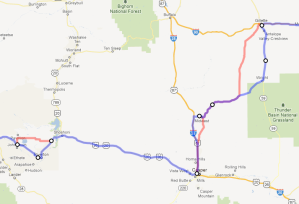
Google Maps - Eastern Wyoming
Red = Google suggested local roads, blue = through roads

So, it looks like Google’s directions could use a few improvements. [5] So let’s see what else is out there …

(Continued in part 2)

  1. Indeed, while drafting this post a BBC News item about Google and robot cars popped up in my news reader.
  2. This particularly odd suggestion appears to have been corrected in the interim since my original query a few months back.
  3. Yes, a difference of less than 40 inches.
  4. I’m not from eastern Wyoming, but AAA’s “local” and “through” labels seemed appropriate to my own eyes as I drove through the area.
  5. Google’s unique features and capabilities will be covered in a follow-up post after all of the other services have been picked apart.

The High Cost of Free Parking

Free parking is something that everyone wants and almost nobody needs. Yet we’ve come to accept free parking as an inalienable right, fought and died for by our Forefathers. However, free parking is anything but — its costs are shouldered by everyone, least of all the actual driver.

Donald Shoup’s The High Cost of Free Parking (2005, American Planning Association) dives into the seemingly mundane topic of free parking and shows the massive impact it has on society. I was a little put off at first by a 600 page book on parking — and truth be told, it could have been shorter as there’s a good deal of repetition in the text — but once I started reading I was fascinated by the web of unintended consequences that ubiquitous free parking hath unleashed upon our cities.

Shoup’s main contention is that free parking is not really free. The driver may not pay for it at the time and place their car is parked, but the inherent cost of providing parking becomes bundled into higher costs for nearly everything else — rent, retail prices, and so on — paid for by drivers and non-drivers alike. Free parking can be seen as a massive yet hidden subsidy for private automobile travel, to the detriment of other transportation options which are more beneficial to society on the whole. That said, this book isn’t an anti-car polemic; rather, it’s a call to bring more transparency to the true private and public cost of automobiles on society.

The three reforms proposed in the book are, and I quote, to:

  1. charge fair-market prices for curb parking,
  2. return the resulting revenue to the neighborhoods that generate it, and
  3. remove the zoning requirements for off-street parking.

These ideas are explored at length, with numerous illustrative examples; I’ll touch on each one below, in reverse order.

Zoning requirements

The self-fulfilling prophecy of parking requirements for specific land uses (e.g. 4 spaces per 1000 square feet of office space) was particularly amusing in a Catch-22 sort of way. Shoup illustrates that when the peak demand for parking is observed and used to establish parking standards, “The maximum observed demand thus becomes the minimum required supply” (emphasis mine). [1] This results in a preponderance of free parking — generally adding up to multiple spaces for every car in a city — that consumes the urban landscape. Where once could have stood a park, a shop, a restaurant, or a house, you’ll now find a barren asphalt square made for machines rather than men. [2]

Returning revenue to neighborhoods

Money earned by charging sensible parking rates ought not to go into the black hole of a city’s general fund. Rather, the revenue (or at least a significant percentage of it) should go back to the neighborhood. This revenue gives neighborhoods some sugar to go with the politically unpopular pill of changing free parking to paid parking, and provides funds to implement and maintain changes that will help draw more visitors to the area (e.g. better sidewalks, more greenspace, etc.). And when parkers are made aware that their funds are going to come back to the neighborhood (via signs on parking meters, as in his example of Old Pasadena, CA), it provides incentive to pony up. Skirting meter rules is no longer a faceless crime.

Fair-market prices

Lastly, but most importantly, the price for parking has to be one that maintains an ideal occupancy. In a perfect world each time one car left a parking space there would be one — and only one — car to take its place immediately thereafter, and no car would ever have to wait for parking (100% occupancy). In the real world, targeting 85% occupancy is a more achievable goal. Keeping this goal in mind, cities can write parking policies that specify an target occupancy rate rather than futzing about with the exact price to be charged. By charging the lowest price that results in the target occupancy rate, there can be no charges of price-gouging. When demand increases, prices can be raised; when demand decreases, prices can be lowered. If the lowest price which can achieve the target occupancy is $0, then so be it — but in most dense urban areas, it’s not likely to be the case.

It may seem unlikely that drivers will acquiesce to paying for previously-free parking, but it’s not money for nothing. Where you may have previously circled the block three times to find an empty space when all parking was free, properly priced spaces will create more vacancies and thus less time wasted trolling about for a spot to stow your iron steed. There are many factors which play into how much time and money a driver is willing to spend on parking (and Shoup provides a number of well-explained formulas to back up his observations), but it’s safe to say that there is price for everything, convenience included. As Shoup notes, “If most consumers valued low prices more than convenience, thousands of products (such as pre-washed, pre-cut lettuce) would cease to exist, and everyone would cook their meals from scratch.”

Conclusion

There’s no doubt that, all other things being equal, we’d all love to have free parking rather than paid parking. But just because we own cars and want to park them without having to pay doesn’t mean that parking ought to be free. After all, there are plenty of things that we want and need more than free parking — free health care, free food, free vacations — that we don’t expect to receive free everywhere we go.

I am admittedly a transportation geek of sorts, so I can’t say that everyone will find this book as intriguing as I did. (Indeed, when I started rambling about some of the book’s anecdotes to my wife, she was obviously less than captivated.) Still, The High Cost of Free Parking is a hard look at how our private choices affect our public spaces and is definitely a recommended read.

  1. Peak demand for free parking, no less.
  2. Alliteratively speaking only, of course. Parking knows no gender.

CCF, WTF

As I looked over some papers I received in the mail regarding my first residential water bill, I thought to myself, “Thank goodness my water usage is measured in CCF. I obviously know what CCF stands for, since it’s a common unit for measuring liquids in my everyday life. And of course, like most other Americans, I think about personal water usage in 100 cubic foot increments, so this will make it easy to correlate my daily water usage with my water bill readings. If I need to figure out how a 1.6 gallon per flush toilet impacts my water usage, it’s just a quick division by 748 to convert gallons to CCF. Monitoring my water consumption has never been so easy!”

Right.

For everyone who doesn’t work at the Bizarro Water Bureau, 1 CCF is 100 cubic feet (centum cubic feet), which roughly equals 748 US liquid gallons [1]. Neither CCF nor cubic feet nor 7.48 or 748 gallon increments are common measurements of liquid volume by individuals, so all water customers are starting from a disadvantage when attempting to evaluate their water bill.

This arcane measurement system means that every municipality has to take time and effort to explain the unit and its conversion. For example, the Portland Water Bureau’s CCF to Gallon Converter is just one of many explanatory pages and online calculators from municipalities across the country. Even though measuring water usage in cubic feet is reasonably grounded in technical reasons (based on pipe size, so sayeth a Portland Water Bureau representative when I inquired), it’s certainly not an intuitive measurement for end-users. Regardless of what unit of measurement is used at the physical water meter, the information ought to be re-framed in a way that’s immediately understood by end users rather than forcing users to speak the professional language.

Additionally, CCF is too blunt a measuring stick. With 1 CCF as the smallest billable unit, up to 747 gallons of water may swing from one billing period to the next. This means that you could reduce water usage by more than 8 gallons (30 litres) every day and not see an effect on a quarterly bill.

“OK smarty-pants, think up something better,” you say? Here are two ideas.

Idea #1

The metric system is uniquely suited for this sort of problem. The SI system of prefixes and interrelated units mean that smaller, everyday quantities (daily usage) scale easily to larger quantities (monthly or quarterly usage).

Consider an example reading of 20 CCF:

CCF 20 CCF 2000 cubic feet 14960 gallons (approx.)
Metric 56.6 cubic metre 56.6 kilolitre 56600 litres (exactly)

While cubic metres suffers the same fault as CCF of not being an everyday unit of measurement, it does have a distinct advantage of converting easily to litres. Although most Americans don’t think in litres as their primary unit of liquid measurement, nearly everyone is familiar with soft drink or booze bottles of the one or two litre varieties. And while the cubic metre is still a fairly large unit of measurement (equal to approximately 264 US gallons), it’s still significantly more fine-grained than CCF.

Idea #2

If municipalities just can’t bear the thought of being branded godless communists for using metric units [2], at the very least, bill per 100 gallons. Consider the same 20 CCF example again:

CCF 20 CCF 2000 cubic feet 14960 gallons (approx.)
Per 100 gal 149 × 100 gal 14900 gallons (exactly)

Average water usage will vary by personal habits, geographical region, housing type, and so on, but the USGA estimates water usage per capita per day at 80–100 gallons, so I think billing in 100 gallon units would be very intuitive. For those using more or less than the average, you could easily tell if you’re saving (or squandering) relative to the average by comparing your billed usage in 100 gallon increments to the number of days in the billing cycle (e.g. 90 day cycle with 90 × 100 gallon usage).

That said, 100 gallons per person per day is generally excessive compared to most of the world, so hopefully that average will drop. As time passes this would upset the easy comparison of days and 100 gallon units, but it would still provide a reasonable high water mark (bah-dump-cha!) for comparison against past usage. Eventually a lower multiple could be chosen if average daily usage drops far enough (e.g. × 50 gal), or a higher multiple chosen to correlate to average per month usage (e.g. × 1000 gal).

That’s great. But who cares?

Why all the fuss over a couple of lines on my water bill? Details matter. The intended audience should always be kept in mind with any writing, and bills are no different. Outlining water usage is a great way to highlight how much of this precious resource is being consumed, but if the presentation is too abstract then the information is lost on the reader.

  1. Don’t even get me started on the confusion between US and Imperial (UK) gallons, or the inane myriad of liquid volume units in the US customary system.
  2. Though if the heathens at the electric company can get away with using kilowatt-hours (kWh), I don’t see any issue here.